Ever wondered why popular Chinese websites seem so cluttered compared to their Western counterparts? Should you follow this trend in your Chinese website design or stick to the modern look? Let us help you decide.
If you have spent some time looking at Chinese ecommerce websites, you can’t help but notice how incredibly cluttered they look. In fact, most of that apparent clutter is a result of link-heavy nature of Chinese internet in general.
What might strike a Westerner as an overwhelming overload of information is likely to be perceived as a content rich and intuitive site by the Chinese.
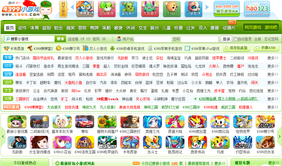
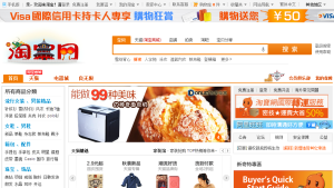
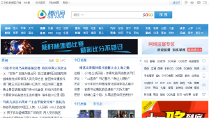
Here are just a few examples of the most popular sites in China:
- Taobao.com – #1 shopping site
- QQ.com – popular web portal
- 4399.com – another popular portal
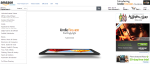
Contrast it with the clean and modern look of the Western equivalents:
- Amazon.com
- iTunes.com
- eBay.com
Chinese website designs seem to be completely avert to modern look with its extensive use of white space, large fonts and well designed color patterns.
Since, apparently it works in China, otherwise they would have “modernized” their designs by now, I became determined to find out why is that the case.
First explanation that I came across was given by Yu Gang and David Wei in their interview with CNN correspondent Kristie Lu Stout in one of CNN episodes “On China”:
“Our consumers like a page very crowded, busy with lots of links, at the same time you opening many windows at the same time… So when you go into the Chinese consumer psyche, they want to have a chaotic bazaar type experience…They want to create this shopping atmosphere”The full transcript of the interview can be found here.
Another explanation on what is causing the preference towards link heavy sites in China was given by Barry Lloyd’s, President of WebCertain Asia (read the full article):
“There is one reason in particular that mainland Chinese sites are incredibly link heavy, and that is that people tend to forget that full literacy in China is a relatively recent development and, when combined with the internet which also uses a ‘foreign’ alphabet, there can be real issues of confidence when people are typing in things to their browser window or when searching through uncertainties with their spelling. This, in turn, has a huge impact on how people navigate to different sites and pages within a site.
