When it comes to design for marketing, does the color perception stays universal across cultures or are there significant differences?
Should marketers adopt cross-cultural approach in marketing communication or attempt to take into account psychological and socio-cultural associations and meanings that different colors convey in various cultures?
Most of the research on color theory has been done in the West and was primarily focused on Western color perceptions. It comes to no surprise that those perceptions differ significantly in the East. Since the color is an integral element of corporate and marketing communications it is important to understand those differences and make necessary adjustments in order to induce desired moods and emotions, which in turn, will help influencing consumers’ perceptions and behavior.
In this post we’ve pulled together information from several sources: article by MUBEEN M. ASLAM in Australian Journal of Marketing Communications (Vol. 12, No. 1, 15–30, March 2006); A Look into Color Theory in Web Design by Sixrevisions.com and Color Branding: The Meanings Behind Colors by Everyjoe.com.
Let’s start looking at each of the main colors:
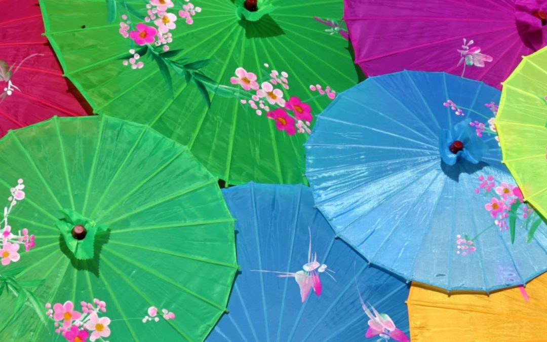
Red

Chinese perception: Love, Happiness, Luck
Summary: while powerful and strong, red also carries some negative connotations in Western culture. For Chinese, however, red is almost universally associated with the positive and good taste;
Yellow

Chinese perception: Pure, Good taste, Royal, Authority
Summary: yellow is perhaps the second most culturally important color after red for the Chinese. Historically, red & gold (yellow) were the colors associated with royalty;
Green

Chinese perception: Pure, Reliable, Happy
Summary: green has been extensively used in web design and remains popular across all the cultures, one of the “safest” colors in marketing design;
Blue

Chinese perception: High quality, Trustworthiness
Summary: universally perceived as a “color of trust”, blue remains the most popular design choice for corporate sites across the continents, excellent fit for health products;
Purple

Chinese perception: Expensive, Luxury, Love
Summary: there are definite similarities in the perception of purple across most of the cultures and it remains a popular choice for designs reflecting sophistication and high value;
Black

Chinese perception: Expensive, Powerful
Summary: for the Chinese, black doesn’t carry the same negative association common in Western cultures (death, unknown) which may complicate its usage to fit both markets.
White

Chinese perception: Death, Mourning
Summary: perception of white couldn’t be more different between Western and Eastern cultures. While gaining popularity in modern design in the West, it should be used with caution for the Chinese audience;