When it comes to designing an email for Chinese EDM campaign, there are few rules to keep in mind. Let’s have a closer look at the main design elements of an email template.
Main design elements to use with Chinese EDM campaign
Images
The best eye catching email designs often include an image at the top. This would be the first and most visible part of the email, therefore it should always have a purpose. In some cases, a logo would do too as long as it reinforces an already familiar brand.
Multiple marketing studies have long concluded that images with people (preferably attractive ones) are most effective. You should always think of what kind of mood the image conveys and whether it serves the right purpose before choosing the right one.
Another technical aspect to keep in mind is to setting a descriptive ALT tag to the image inside the HTML template in case the picture doesn’t load for whatever reason.
Since the large proportion of recipients in China would use smartphones to check their emails, it’s important to make sure that the details of the header picture are clearly visible once it has been shrunk to fit small screen. At the same time, it shouldn’t take more than half of the mobile device’s screen.
Overall picture size is another important consideration. Ideally, in order to load fast enough with relatively slow Chinese mobile networks, the images should not exceed 50 KB without loss of quality.
Headline
Headline can be set either above or below the header image and should be short and concise enough with as few words as possible. Fortunately, since Chinese language allows to pack more meaning in smaller space, it is often easier to accomplish than in English.
Headline copy doesn’t have to be totally descriptive but as long as it is interesting or intriguing enough, it would serve as a “hook” to a reader encouraging them to take a closer look at the content.
Headline is extremely, if not the most, important element of a promotional email. This is why it is always a good idea to run a few headline versions by native Chinese speakers to gather some feedback before settling on the best one.
Call to Action
Call to Action or CTA as it is often abbreviated is, perhaps, the next most important element after the headline. Since it has to stand out, CTAs are often designed as buttons.
Research shows that red and orange buttons attract most clicks, although they should still match the overall design as to not look too much out of place.
Last thing you want is for an email recipient to be confused about what to do with it, this is why CTA is so critical. Best email designs often use clever imagery that would direct attention to CTA at unconscious level. For example, a person in an image could be facing or pointing in the direction of a CTA button. Amazingly enough, such subtle tricks work quite well.
Another tip is to include two CTAs in Chinese EDM email template: one at the top and one at the bottom. The top one should work for people who get interested right away, so they wouldn’t have to scroll all the way to the bottom. However, the bottom placed CTA would be a more natural choice for those recipients who got engaged enough to read the entire content of the email.
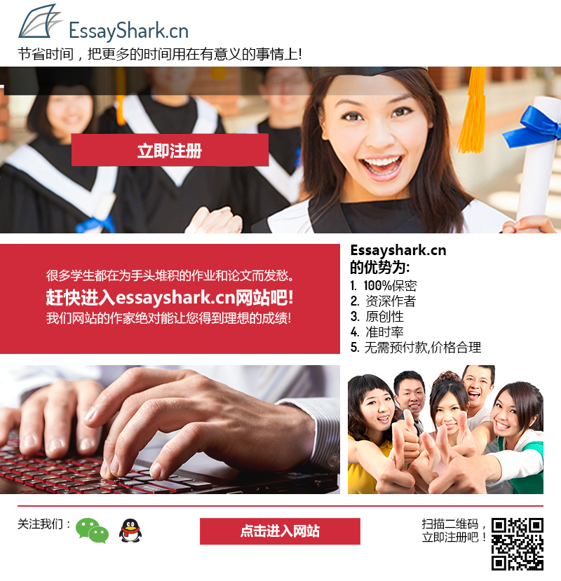
Here is an example of an email template for one of our recent Chinese EDM campaigns that contains many of the right elements discussed above – header image, catchy headline and clear CTA button (courtesy of EssayShark.cn):
Main copy
We live under permanent information overload which causes us to constantly filter out information, both consciously and subconsciously. Nowadays, very few people possess enough patience to read long ads unless the content happens to be really important to them. In fact, very few people actually read emails rather than just scanning them.
This is why the shorter the main copy – the better the results your Chinese EDM campaign is going to deliver. Packing just enough content into ad copies that are as short as possible is an art in and of itself and it is something that is the absolute must for email marketing.
Ideally, the image, the headline, the copy and the CTA should appear “above the fold”, in other words, without having to scroll down the email. This can be quite challenging, especially in one column design for a smartphone. If it is not possible, consider showing at least the first and the most important paragraph at the top.
Mobile friendly design
As mentioned above, Chinese recipients would most likely read their emails on a phone. This is why it is important to make sure that the email renders properly with a smaller screen. It is most commonly achieved by responsive design which has become a de facto standard in web design nowadays.
In such designs, multi column emails are typically stretched into just one column. This is why you should make sure that the most important content, such as headline and CTA, appear at the top instead of being tucked down at the bottom.
Fortunately, larger screen smartphones are becoming more popular, easing some of the tight constraints in terms of space.
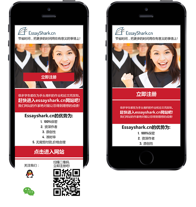
Note how the same email template renders on mobile with most of the important content showing above the fold in the same example from the same EssayShark campaign:
Colors
Color perception varies from culture to culture and Chinese have their own preferences that may not always align with those of the Westerners. We have a published a detailed article on color perception considerations in marketing design for Chinese market which discusses this concept in more details.
The colors that invoke similar reactions among Chinese and Westerners are:
- Blue – is associated with high quality and trustworthiness;
- Purple – reflects sophistication and high value;
- Green – identifies with being pure and reliable.
Also, green in Chinese culture is not associated with “inexperience” as it is the case in Western subconscious perception. This makes the above colors the safest choices for email marketing in China although they may not be impactful enough.
If you want to pack more punch with your Chinese EDM, consider going with red and yellow – they are often considered more effective colors in China. Those colors have traditionally been associated with royalty and authority. Red in particular is the color of happiness, love and luck in China while for Westerners it is subconsciously associated with danger, fear and anger.
Black is also perceived as a positive color in China while white has been the traditional color of death and mourning.
Stay tuned for the part 2 where we will discuss the requirements for the content.